6 Conference Room Layouts To Structure Your Events
Artwork by Mónica Alexis
6 Conference Room Layouts To Structure Your Events
Quick! Picture a conference room. How’s it laid out? Chances are the image in your head is rows of chairs filled with people wearing conference name badges, all looking forward to a podium or a rostrum with a keynote speaker. That’s not the only way to layout your conference room. There are many, and they all give your attendees a different meeting experience.
Why Your Conference Room Matters
The average cost of hosting a simple, stand-alone conference in the USA is around $700,000. Even a smaller conference will cost in the tens of thousands. With so much money down, it’s important to get maximum value from your conference. Your room layout can impact the way your attendees engage with your content, with each other, and ultimately, with your company. To put it bluntly: Your conference room can be the difference between a conference that drives results and one that turns your partners, customers, and other stakeholders away.
Conference Room vs Meeting Room
Some businesses and event planners use these two terms interchangeably, but a conference room is rarely the same thing as a meeting room. Meeting rooms are smaller, more intimate, and designed to facilitate a two-way conversation or group collaboration. They’ll usually have one table in the middle of the room or a desk where people can sit opposite each other. A conference room will usually be larger. It will include audio-visual equipment like whiteboards, digital screens, and audio equipment. A conference room can set up two-way conversations (more on that later), but will also need a spot for someone to lead, guide, or present the seminar. It’s often possible to use a conference room for meetings, but it’s much more difficult to use a meeting room for a conference.
Choosing a Layout
The type of conference you’re conducting can impact how you design the room, and vice versa. Key questions you need to understand before you lay out your conference room include:
- How many people will you be hosting?
- How many presenters or speakers will you have?
- Is there an interactive component?
- Will there be collaborative components?
- Are your attendees in groups or individuals?
- Will there be food or drinks served during presentations?
- How long will your conference go for?
- Will there be one room or multiple rooms?
- What do you want to get out of the meeting?
Different Conference Layouts
Here are some examples of typical conference layouts and the ways in which they serve your needs differently:
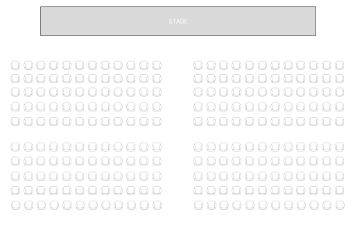
Auditorium
Auditorium conference layouts are best for extremely large groups and one-way presentations. You might use an auditorium as the conference opening or for keynote addresses, before breaking out to other conference room types for your next set of meetings. The auditorium layout is characterized by stadium-style seating, facing a stage, and a raised stage or dais from which presenters deliver their seminars. It might also include a large video screen and audio-visual aids. Auditorium conference layouts are good for things like:
- Product presentations
- Keynote speeches
- Sales seminars
- Training sessions
- Multi-media presentation
Use an auditorium layout to convey gravitas, and to train your audience’s attention where you want it.

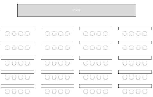
Lecture Theatre
A lecture theatre or classroom layout is similar to an auditorium, but usually involves a desk which attendees can place computers or notepads on to record key information during the meeting. It’s a little better for more detailed training seminars or when there’s an element of work, interaction, or participation required from attendees. Classroom layouts can be small or large, suitable for a wide range of group sizes. They’re usually for medium-sized groups, and most effective when there’s a lot of information to convey. These conference room setups work well for:
- Product presentations
- Training
- Onboarding new personnel /partners
- Sales seminars
Use a lecture theatre or classroom layout when you want your audience to take away a lot of important information.
Boardroom
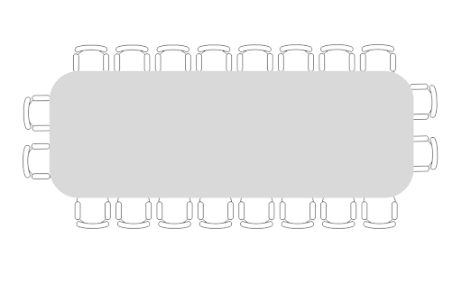
Boardroom style layouts are good for small groups, especially when you want everyone in the conference to have an equal opportunity to contribute or speak. Common boardroom layouts have an oval or round table so that everyone has clear sightlines, making it easier to speak. There’s only one table in this style of set up, and everyone sits around it. The nature of the boardroom table can also help engage your audience in small group discussions. It makes it harder to zone out as everyone is in each others’ eyeline and the focus is shared around the room. This is a more intense layout, best used for:
- Open discussion
- Video conferencing
- Focus groups
- Decision making
- Stakeholder engagement
A boardroom can feel less impressive than other forms of conference layout, but it can also make your audience feel more connected to the material you’re presenting.
U-Shaped Desk Layout
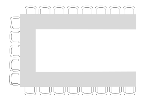
Setting your conference room up in a U-shape facilitates communication and interaction between your attendees and the conference leader or presenter. This layout is good for smaller to medium-sized groups of less than 20 or so. Too many people, and everyone talks over each other, and not enough people get the attention or focus they need to benefit from your conference. The shape of the U with two longer legs allows the presenter to stand at the front of the room. If they’re more of a facilitator role, they can also stand in the middle, or walk around the inside of the tables to present and lead the discussion. U-shape style conference layouts are used commonly for:
- Guided education or training
- Workshops
- Multi-channel communication
- Breakout sessions
- Focus groups
It’s not uncommon to break out into a U-shaped room after a conference group finishes the morning seminar or keynote speech.
Banquet Table Layout
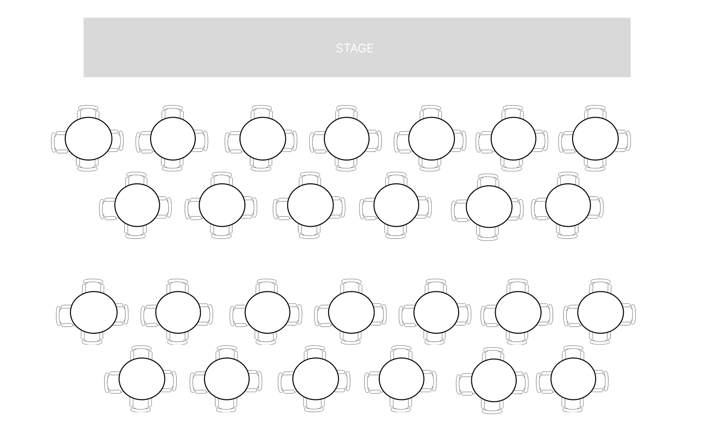
Using multiple tables is a great way to make a large and diverse group of conference participants feel closer and more connected to each other. This style of layout is characterized by tables, usually round, of up to 8 or 10 people each. The banquet hall layout is scalable because you can just add more tables to accommodate different sizes of conference. This conference configuration is ideal for:
- Awards ceremonies
- End-of-conference summary meetings
- Conferences that involve meals
- Conference seminars with quick-fire breakout sessions
The banquet style makes it easy to dive into a huddle for brainstorming sessions or workshops and then immediately focus back on a more unilateral presentation led by a speaker or host.
Hybrid Layouts
You can always break away from convention at your conference by adding a twist to these layouts. For example, a banquet layout might benefit from a raised dais, on which a long table of keynote presenters or hosts sit. This is a good layout for a shareholder meeting, where shareholders sit in banquet format and the board sits on a raised stage at a long table, so they can speak to the shareholders between courses or breakout groups.
Multiple Layout Formats
Many modern conferences have more than one day of activity, or more than one session. You might choose specific layouts for specific functions. A useful conference format might look like this:
- Day 1, AM: Registration: At this stage, you’re busy organizing badges and handing out conference badge holders to guests. Typically, this is a foyer or entry room; you might even have a printer running on-site badge printing for last-minute registrants.
- Day 1, PM: Banquet: A welcome dinner with an MC or host guiding guests through a meal and brief introduction to your conference, for which you’d use a banquet layout.
- Day 2, AM: Seminar: Guests might file into a stadium or lecture theatre to hear a keynote presentation or speaker.
- Day 2, PM: Breakout Session: Guided conference discussions with smaller groups based on interest or specialty.
Each of these requires a different layout – if you have a medium-large group, you might be able to conduct a morning seminar in a lecture or classroom style format, and then quickly rearrange desks into another format for the afternoon. Understanding how and when you need your guests to be in which seating configuration will dictate how you need to operate your schedule.
Finding the Right Conference Setup is Easy
A conference planning checklist that includes questions like the number of guests, the type of content you want to present to them, and the overall takeaways you want your team members to carry away with them will help you get the best results from your group meeting. If you need help managing your guests, Conference Badge is here to help. We offer high-quality cardboard badges, including double-sided conference badges, badge inserts, and holders to suit a wide range of conferences.
Check out ConferenceBadge.com today.
Conference Layout FAQs
What are the best dimensions for a conference room?
The best room size for any conference is dictated by the number of attendees and your chosen room design. Auditorium style rooms are good for packing larger groups into a space efficiently.
How do you set up a meeting room?
Your ideal meeting room setup depends on a lot of factors, like: Do you have interactive whiteboards, are you participating in a video conference, and how big is the group of people attending? From there, you need to decide what the focal point of the meeting will be. Answer those questions and you’ll find it easy to set up your meeting room.
What is the most efficient layout for a small conference room?
In-person meetings can be expensive, so it’s important to use your venue layout efficiently. First, get rid of any conference room equipment you don’t need. If you have a whiteboard but won’t use it, store it elsewhere. Lastly, focus on the types of meetings that you’ll need – you won’t need a large conference table if it’s a one-way presentation, instead you can line up chairs in rows and face the podium.
