4 Basic Principles For Choosing The Best Font For Event Name Tags

Like any other aspect of design, finding the perfect font can be hard work, especially when you know that different fonts can significantly impact the message being conveyed.
“Optimizing typography is optimizing readability, accessibility, usability(!), overall graphic balance.”
- Oliver Reichenstein
Although you don't need a design degree to create event badges with Conference Badge, here are four guiding principles to abide by when choosing the best font for your event name tags.
Why is the font choice important?
You might already know the basic fonts, like Arial, Helvetica, or Times New Roman, but did you know that there are millions of fonts available ?
Whew, it’s overwhelming.
The font on a website, a logo, a sticker, or an advertisement can greatly impact the way the message is received. For example, if you consider your business being more 'professional,' you might want to choose a serif font like Georgia, Playfair Display, or PT Serif. On the other hand, if you want something more 'quirky' or 'fun,' you might look into a script font like Pacifico. Finally, a sans-serif font pairs well with a modern or innovative business. Again, knowing your business and the type of message you want to convey will help you narrow your font category.

Four fundamentals practices
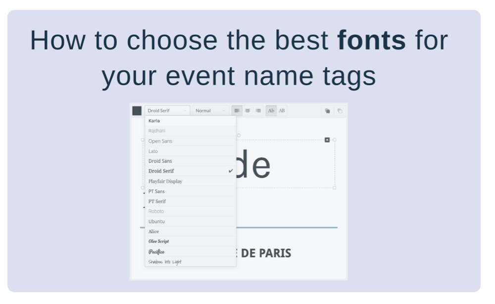
Figuring out how to pick the perfect font can be overwhelming. Lucky for you, Conference Badge offers 15 different fonts, which narrows it down. Still, you want to impress your guest with awesome badges that represent well your event or business.

1. Follow your brand identity
If you already have an event branding, your job has become much easier, as you want cohesion between your brand and your name tag design. Select a font that is at least similar to your branding, or research font pairing. If you don't have a branding, start by gathering your team or a few friends and brainstorming about your event identity. Or, choose a few options and narrow it down by playing with the different fonts in the Conference Badge editor.
2. Choose a readable font
Because name tags are also used as a networking tool, you want to enable your name badge holders to make connections throughout your event, and a perfectly designed name tag can be a great conversation starter. When selecting your font, you want it to be easy to read and easy to identify other people. It’s more achievable by using a bold font and by avoiding cursive or italic. You also want to pick a color that contrasts nicely with the conference badge's colored or white background.
For a name tag font size, you want 60 px for a first name and something smaller for the last name or the other way around. Most of the templates you can find on Conference Badge follow those guidelines but are 100% customizable.

3. Make sure that the font is versatile
It's worth spending a little more time picking a font because it should be consistent across your event branding. Will you be creating some online advertising? Flyers? A website? You want your font to be easily adaptable to all mediums and interfaces.
4. Get feedback from peers
If you have a team, it could be a great idea to get honest feedback from your peers on your name tag designs. Great news, you can edit your badges as much as you want with Conference Badge so don’t hesitate to go back to the drawing board or choose another theme if you’re not 100% convinced. Because your event is most likely targeting a specific group of people, you can also get feedback from a targeted Facebook group or even by making a poll on social media. Get creative and get that validation!
5. Bonus: Design different badge designs for different badge type
In hosting more prominent events, organizers often create different badge designs for different types: vendors, speakers, general attendees, staff, volunteers, partners, etc. You could play with colors, the name tag size, or completely change the font style of the different badges. Some could be full color, others, black and white. The opportunities are endless.

If you want to read more about creating the perfect name badge design, we have a whole article that gives more info about all aspects of a conference badge, blueprint included. Create awesome name tags for your next event with Conference Badge. In 3 simple steps, choose your badge size, design, and get them delivered to you before your event.
Try it today!
